Effective error handling in mobile apps ensures users can navigate issues without frustration. Apps face challenges like unstable networks, device differences, and user mistakes. Poorly managed errors can lead to crashes and loss of trust, while clear communication and recovery options improve user experience. Here's what matters most:
- Fail Gracefully: Keep apps running and preserve user progress during errors.
- Clear Feedback: Use simple, actionable error messages that guide users.
- Anticipate Issues: Handle expected errors (e.g., invalid input) with safeguards and provide fallback options for unexpected ones.
- Test Thoroughly: Simulate errors during development to ensure recovery flows work.
UI Design Essentials: Managing Errors
Core Principles of Effective Error Handling
Smart error handling ensures a smooth user experience, even when things go wrong. Let’s dive into how to maintain user progress and provide clarity during errors.
Fail Gracefully and Preserve User Progress
When errors happen, the last thing users want is to lose their work. Graceful failure ensures your app keeps running, even if some features experience problems. This way, users can continue their tasks without interruption.
One key strategy is state preservation. Automatically save user input, form data, and navigation progress so users don’t have to start over. For example, if a user fills out a long form and loses connection, the app should save their input locally until the connection is restored.
Another important concept is progressive degradation. If certain features or services are temporarily unavailable due to network or server issues, clearly inform users about what they can still do. Offline features should remain accessible, while the app works in the background to regain full functionality. This approach keeps users productive and reduces frustration.
At the heart of these strategies lies the importance of clear communication, which brings us to error messaging.
Provide Clear and User-Friendly Feedback
When errors occur, users need clarity - not confusion. Use simple, direct language to explain the issue and guide them toward a solution.
A well-crafted error message has three parts: it explains what went wrong, why it matters, and what the user can do next. For instance, instead of a vague "Error 404: Resource not found", a better message might say, "We couldn’t find that page. Please check your internet connection or return to the home screen."
Contextual feedback makes these messages even more effective. For example, instead of saying "Invalid format", specify the issue: "Please enter a valid email address, like example@email.com." This not only resolves the problem but also educates the user for future interactions.
Timing and placement are just as important. Error messages should appear instantly and in the right context - right where the issue occurs. Users shouldn’t have to search for feedback or guess whether their action succeeded.
Differentiate Expected vs. Unexpected Errors
Not all errors are the same, and your app should handle them accordingly. Expected errors - like invalid input or network timeouts - can be anticipated and addressed with specific solutions. Unexpected errors, on the other hand, require broader recovery strategies and detailed logging for developers.
For expected errors, build in safeguards like form validation, retry mechanisms for network requests, and clear instructions for resolving common issues like authentication failures. These errors should have actionable, user-friendly messages because the nature of the problem and its fix are well understood.
Unexpected errors, however, need a different approach. Use general, reassuring language that acknowledges the issue without overpromising. For example, "Something went wrong. Please try again later." Behind the scenes, log these errors thoroughly so developers can investigate and resolve them.
Designing Effective Error Messages
When it comes to user feedback, error messages are a critical piece of the puzzle. They serve as a guide when things go wrong, offering users the clarity and direction they need to resolve issues. A well-designed error message can keep users engaged, while a poorly crafted one might drive them away.
Clarity and Context in Error Communication
Error messages should speak the user's language - not the developer's. They need to turn technical problems into straightforward, actionable explanations. A good error message tells users what happened, why it matters, and what they can do about it.
Here’s a practical example: Instead of saying "Something went wrong", specify the issue. If a payment fails, don't just display "Transaction error." Let users know if the card was declined, there are insufficient funds, or if it's a temporary processing issue. This kind of detail helps users understand the problem and take the right steps to fix it.
Context is equally important. Error messages should appear exactly where and when the problem occurs - not buried in a notification or hidden in a menu. For instance, if a user enters an invalid phone number, highlight the specific field with an explanation of the correct format. If a photo upload fails, show the error message right next to the upload button with clear next steps.
Timing matters, too. Real-time validation can catch issues before users even hit "Submit", while immediate feedback after an action ensures users aren’t left wondering what happened. Whether it’s a success or a failure, users should always know where they stand.
Examples of Good vs. Poor Error Messages
The difference between a helpful error message and a frustrating one becomes obvious when you compare them side by side. Effective messages provide clear information and actionable steps, while poor ones leave users guessing.
| Poor Error Message | Good Error Message | Why It Works |
|---|---|---|
| "Error 500" | "We're experiencing technical difficulties. Please try again in a few minutes." | Uses plain, understandable language and sets expectations. |
| "Invalid input" | "Please enter a valid email address (example: john@email.com)." | Explains the issue and provides a clear example. |
| "Network error" | "Check your internet connection and try again. If the problem continues, try switching to Wi-Fi." | Offers specific troubleshooting steps. |
| "Authentication failed" | "Your password is incorrect. Tap 'Forgot Password' to reset it." | Identifies the exact problem and offers a direct solution. |
| "File too large" | "Your photo is too large (5.2 MB). Please choose an image under 2 MB." | Shows both the actual size and the required limit. |
These improved messages avoid technical jargon, give users the details they need, and provide clear next steps. They treat users as people looking for help - not as systems needing debugging.
Provide Users with Recovery Options
A clear error message is a great start, but offering recovery options takes it to the next level. Every error message should give users a way to fix the issue.
Action buttons like "Retry" can turn a passive message into an interactive solution. For example, if a form submission fails due to server issues, include options like "Try Again" or "Save Draft" to ensure users don’t lose their progress.
Layered assistance helps users resolve problems step by step. Start with simple fixes, like retrying the action or checking settings. If those don’t work, provide links to help documentation or options to contact support. This gives users the tools to solve issues independently while ensuring help is available when needed.
Contextual alternatives keep users moving forward. If a payment fails, suggest alternative payment methods or let users save items for later. If a feature is temporarily unavailable, guide them to similar functionality they can use in the meantime.
Finally, proactive guidance can prevent errors before they happen. For example, warn users about file size limits or character counts before they hit submit. This approach reduces frustration and keeps the experience smooth.
The goal is to make errors feel like temporary setbacks, not dead ends. Users should feel supported and confident that they can resolve issues with the tools and information provided by your app.
sbb-itb-e343f3a
Implementing Error Handling Patterns and Recovery Flows
When it comes to mobile apps, handling errors effectively is a must. A well-thought-out error handling system not only protects the user experience but also bolsters the app's reliability. To achieve this, it's essential to establish clear recovery strategies for both predictable and unexpected failures. These strategies build on the principles of graceful failure and delivering clear, helpful error messages.
Structured Error Handling Approaches
A consistent approach to error handling is key. Start by distinguishing between anticipated issues (like invalid user inputs) and unforeseen problems (like server crashes). For anticipated errors, use tools like try/catch blocks to manage them at the code level. For larger, system-wide issues, implement global error handlers. This layered method ensures your app can handle problems effectively without derailing the entire user experience.
Designing Recovery Strategies
Recovery strategies are your safety net when things go wrong. Automated retries, fallback options, and handling network timeouts can significantly reduce user frustration. For example, if a network request fails, your app could retry the request automatically or offer offline functionality as a fallback. The key is to align these recovery mechanisms with your app's specific needs, making sure they integrate smoothly with your error management system. This way, users can continue their tasks with minimal interruption, even when a feature encounters problems.
Ensuring Consistent Error Feedback
Clear and consistent error feedback is critical for maintaining user trust. Use straightforward error messages paired with visual cues or status indicators to keep users informed. For instance, a loading spinner turning into an error icon with a short, actionable message can make a big difference. Make sure these elements align with your app’s design language to create a cohesive experience. When users know what went wrong and how to fix it, they feel more in control and confident navigating your app.
Testing Error Handling with Automated UI Testing
Testing error handling ensures that your app's recovery system works seamlessly, allowing users to navigate through issues without frustration. Automated UI testing is essential for confirming that error messages display correctly, recovery flows function as intended, and users can continue their tasks without getting stuck or losing progress.
Simulating Error Scenarios with Automation
Automated testing frameworks make it easy to create controlled error conditions that are often too tricky or time-consuming to reproduce manually. For instance, you can simulate network timeouts, server crashes, invalid API responses, or even device-specific glitches. Imagine testing a network disconnection mid-file upload or handling an invalid server response - automation allows you to recreate these scenarios effortlessly.
Using Maestro for Error Handling Testing
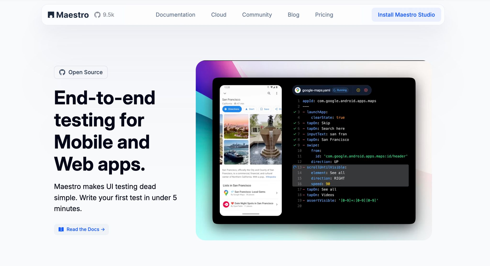
Maestro simplifies error scenario testing with its YAML-based flow system. It eliminates the hassle of managing UI delays and timing variations, making the process smoother and more efficient.
Maestro was specifically designed to address common pain points in mobile testing frameworks like Appium, Espresso, UIAutomator, and XCTest - eliminating complex setup, reducing test flakiness, and making tests accessible to non-technical team members through its YAML-based syntax.
One of Maestro's standout features is its cross-platform support, which lets you validate error handling on iOS, Android, and web apps using the same test flows. This ensures that error messages, recovery options, and user feedback remain consistent across all platforms.
| Maestro Capability | Description | Benefit for Error Handling Testing |
|---|---|---|
| Built-in Flakiness Tolerance | Handles UI instability and timing unpredictability automatically | Ensures reliable testing even during erratic app behavior |
| Network Delay Handling | Waits for content to load without manual adjustments | Accurately tests network timeouts and recovery workflows |
| YAML-Based Flows | Simple, declarative syntax for creating tests | Makes complex error simulation workflows easy to manage |
| Cross-Platform Testing | Supports iOS, Android, and web with one tool | Validates error handling uniformly across all platforms |
| Fast Iteration | Runs tests without needing compilation | Speeds up testing of error handling during development |
Here’s a quick example of how an error handling test flow might look in Maestro:
appId: com.example.app
---
- launchApp
- tapOn: "Upload Photo"
- tapOn: "Select Image"
- tapOn: "Confirm Upload" # triggers network failure simulation
- assertVisible: "Upload failed. Please try again."
- tapOn: "Retry"
- assertVisible: "Upload successful"
Benefits of Visual Test Creation with Maestro Studio Desktop
While automated test flows are powerful, Maestro Studio Desktop (a free visual IDE) takes it a step further by enabling non-technical team members to actively participate in error handling testing. With its visual test creation tools, team members like QA testers, product managers, and designers can build and validate error scenarios without writing a single line of code.
The element inspector feature removes the guesswork when targeting specific error messages or recovery buttons. Instead of manually coding selectors, testers can visually identify UI elements and create test flows by interacting directly with the app. This precision is crucial for verifying error messages and recovery options.
Additionally, Maestro Studio's interaction-based command generation allows team members to simulate error conditions by clicking on elements in the app. When you interact with UI elements in Maestro Studio, it automatically generates the corresponding YAML commands. For example, a tester could click through an error dialog and retry button, and Maestro Studio would generate the corresponding test commands.
By involving multiple team members in the test creation process, you gain a more comprehensive understanding of potential failure points and recovery workflows. Tools like MaestroGPT an AI assistant built into Maestro Studio and the Maestro Console, further enhances this process by assisting with command generation for complex error scenarios or answering Maestro-related questions.
The visual approach also makes maintaining error handling tests much easier. When UI elements or error messages change, non-technical team members can quickly update the test flows without waiting for developer intervention. This flexibility ensures your error handling tests stay up-to-date as your app evolves.
Conclusion and Best Practice Checklist
Key Takeaways for Better Error Handling
Handling errors effectively can turn a potentially frustrating user experience into one that builds trust and confidence. Let’s face it - your app will encounter issues at some point. What matters is how you respond. The key lies in clear communication, smooth recovery options, and thorough testing.
Great apps don’t just fix errors - they anticipate them. By viewing errors as opportunities to improve the user experience, you can transform every error message into a moment to reinforce trust. Each recovery flow becomes a chance to show how dependable your app truly is.
Testing is at the heart of this process. As the Maestro team puts it:
"With Maestro, catching issues early in the development lifecycle is dead simple. Protect every workflow so you find problems before your users do."
Consistency across platforms is equally vital. Whether your users are on iOS, Android, or the web, they should encounter the same level of clarity and support. This not only makes your app feel reliable but also simplifies the experience for users switching between devices.
The checklist below captures these principles, offering a quick guide to creating error handling that keeps users engaged and confident.
Error Handling Best Practice Checklist
User-Focused Error Messages
- Write error messages in clear, plain language.
- Explain what went wrong and why it happened.
- Provide actionable next steps for recovery.
- Avoid using technical jargon or error codes in user-facing messages.
- Include context to help users understand what they were trying to achieve.
Recovery Flow Design
- Offer straightforward recovery options like "Retry", "Go Back", or "Try a Different Method."
- Preserve user progress and provide fallback options during recovery.
- Implement automatic retries for temporary network issues.
- Test recovery flows under various conditions, like poor network connections or different devices.
Consistent UI States
- Ensure error states visually align with your app’s design system.
- Use familiar icons and colors to differentiate error types.
- Make error dialogs and messages responsive to different screen sizes.
- Provide clear loading states to indicate retry attempts.
Comprehensive Testing Strategy
- Automate tests for both expected and unexpected error scenarios.
- Simulate real-world issues like network timeouts or server failures.
- Test error handling consistently across all platforms.
- Verify that error messages are clear and recovery options work as intended.
- Involve non-technical team members in testing to catch overlooked edge cases.
Development Integration
- Incorporate error handling tests into your CI/CD pipeline.
- Use testing frameworks designed to handle mobile app flakiness.
- Set up global error handlers alongside specific ones for unique cases.
- Monitor production error patterns for ongoing improvements.
- Document common errors and how they should be handled.
By involving a diverse range of perspectives in error scenario testing, you can uncover edge cases that might otherwise go unnoticed. This approach ensures your error handling strategies are not only robust but also user-centered.
Finally, remember that error handling isn’t a one-and-done task. As your app evolves and users interact with it in new ways, your error-handling processes need to evolve too. Regular testing and user feedback are essential tools for refining your approach and ensuring your app continues to support user success.