
Want to ensure your mobile app delivers a flawless user experience? Follow this 10-step UI testing checklist to identify and fix potential issues before your app reaches users. With over 5.78 billion unique mobile users globally, and 80% of them uninstalling apps that don't meet their expectations, effective UI testing is critical to your app's success. Here's what you need to cover:
- Set up a test environment: Use real devices and emulators for diverse testing scenarios.
- Cross-platform testing: Ensure consistency across Android and iOS devices.
- UI consistency: Check fonts, colors, and alignment for uniformity.
- UI functionality: Validate buttons, forms, and gestures for smooth interactions.
- Responsive design: Test layouts across screen sizes and orientations.
- U.S. regional settings: Verify date formats (MM/DD/YYYY), currency ($), and imperial units.
- Performance testing: Check speed, load handling, and resource usage.
- Interruption handling: Ensure the app functions during calls, notifications, or network changes.
- Automate testing: Use tools like Maestro to simplify repetitive tasks.
- Usability and accessibility: Make your app user-friendly and inclusive.
Key takeaway: A structured approach to UI testing ensures your app meets user expectations, reduces uninstall rates, and builds trust. Use this checklist to deliver a polished and reliable app.
Practical Guide to Mobile Testing | Mobile Testing Tutorial | Software Testing | Podcast
Step 1: Set Up Your Test Environment
Creating a well-prepared test environment tailored to various device specifications can help you avoid frustrating debugging sessions later on.
For the best results, use a mix of real devices for authentic experiences and emulators or simulators for scalable, early-stage testing.
Device and OS Requirements
Start by building a device matrix based on your target audience's preferences and market trends.
Real devices are essential for capturing actual hardware behaviors and performance metrics, such as GPS, camera functionality, and sensor accuracy. For U.S. markets, focus on popular devices like the latest iPhone models (from iPhone 12 to iPhone 15 series) and leading Android flagships.
Simulators are great for mimicking software behavior, particularly for UI checks, while emulators can simulate both software and hardware.
Here’s a general rule of thumb: run about 90% of your unit and UI tests on virtual devices, reserving 10% for real-device testing. For multi-merge validations, a 70/30 split is often more efficient, with additional real-device tests scheduled during off-peak hours.
| Testing Activity | Real Devices | Emulators/Simulators |
|---|---|---|
| UI layout testing | ✅ | ✅ |
| Functional testing for large builds | ✅ | |
| Hardware dependencies (GPS, camera) | ✅ | |
| Display testing (pixels, resolutions) | ✅ | |
| Natural gestures (pinch, zoom, scroll) | ✅ | |
| Push notifications | ✅ |
Keep your device matrix up to date as new devices and operating system versions hit the market. iOS updates usually roll out in September, while Android updates are released throughout the year. To cover most users, test on the current OS version as well as the two previous ones.
Network Configuration
Your app’s performance can vary greatly depending on network conditions, so it’s critical to test under a range of real-world Wi-Fi, 4G, and 5G scenarios.
Make sure to check app stability during network interruptions and when transitioning between Wi-Fi and cellular connections. Testing on slower, throttled connections is also important to identify potential issues for users with limited data plans.
To speed up validations, run tests in parallel across platforms using virtual devices first, followed by targeted testing on real devices for final checks.
Step 2: Check Cross-Platform and Cross-Device Compatibility
Once you've set up a solid testing environment, it's time to tackle cross-platform and cross-device compatibility. This step is critical to ensure your app provides a seamless experience, no matter if users are on Android or iOS. Each platform comes with its own quirks - UI elements, gestures, and system interactions can vary significantly. Thorough testing helps prevent user frustration and negative reviews by ensuring your app behaves consistently across different devices and operating systems.
Testing complexity often depends on the platform. Android, with its diverse OS versions and devices, demands more attention compared to the relatively uniform iOS ecosystem. iOS users tend to update to the latest version quickly, while Android users are more likely to stick with older versions. To make testing efficient, focus on the devices and OS versions most popular with your audience. Use analytics to identify these trends, and test on both high-end and budget devices to cover a broad range of hardware and performance scenarios.
For apps targeting U.S. users, it’s also essential to validate local formatting to meet their expectations.
U.S. Locale Testing
Testing for the U.S. market goes beyond simple language translation. Your app needs to handle specific formatting conventions that American users expect. This includes using the dollar sign ($) for currency, MM/DD/YYYY for dates, and commas as thousand separators for numbers. Measurements should use imperial units like feet, inches, and pounds, and temperatures should be displayed in Fahrenheit.
To simplify this process, rely on native formatting libraries that automatically adapt to the user’s locale instead of hardcoding formats. This approach not only minimizes errors but also makes it easier to expand into international markets in the future.
Finally, ensure these locale-specific elements display correctly on screens of all sizes.
Screen Size and Resolution Testing
One of the toughest challenges in mobile UI testing is accommodating the wide variety of screen sizes and resolutions. Your app should function flawlessly on everything from compact 5-inch phones to large 12-inch tablets.
Prioritize testing on the most popular screen sizes in your target market. For iOS, focus on the standard dimensions of recent models. For Android, include devices from major brands and test at least one lower-cost model to account for differences in screen density and resolution.
Pay special attention to edge cases, such as older devices with small screens or modern tablets and foldable phones with unique aspect ratios like 18:9 or 21:9. Test how your app handles these variations to ensure UI elements remain readable and interactive.
| Screen Category | Key Testing Focus | Common Issues |
|---|---|---|
| Small phones (5–5.5") | Touch target size, readability | Cramped UI, tiny buttons |
| Standard phones (6–6.5") | Overall layout balance | Baseline compatibility issues |
| Large phones (6.5"+) | Content scaling, thumb reach | Wasted space, poor navigation |
| Tablets (8–12") | Multi-column layouts, landscape mode | Stretched UI, poor space use |
This careful testing ensures your app looks and works great no matter the screen size or device.
Step 3: Check UI Consistency
After testing your app across different devices and locales, the next step is to focus on UI consistency. A consistent user interface ensures that fonts, colors, and alignments remain uniform throughout your app. This not only enhances the app's visual appeal but also builds trust and reinforces your brand identity.
Inconsistencies often creep in during development - especially when multiple team members are involved or when design updates are applied unevenly. For example, mismatched text styles can make your app look unpolished, while inconsistent color schemes can confuse users and weaken your branding. Alignment problems, where elements don't line up properly, can disrupt the overall user experience and make the interface look sloppy.
To address these issues, take a methodical approach to testing, focusing on both visual design and text formatting.
Visual Design Check
Start by evaluating all visual elements in your app to ensure they are consistent across the interface. Pay particular attention to text styles. Use a well-defined font stack with fallback fonts to avoid typography issues. Check your styling code and manually review layouts to identify any overrides or misalignments across different devices. Consistent font sizes, weights, and line heights are essential for creating a clear and logical visual hierarchy.
Color consistency is equally important, both for usability and to maintain your brand's identity. Use accessibility tools to test color contrast and gather user feedback to ensure your color scheme is applied uniformly. Verify that your primary, secondary, and accent colors are used consistently throughout the app.
Finally, address spacing and alignment. Perform visual tests to identify any misaligned elements across devices. While automated tools can help, don’t rely on them entirely - manual inspections are crucial for catching subtle layout issues that automated checks might overlook.
Once you’ve ensured visual consistency, move on to testing interactive elements to confirm they function as expected.
Step 4: Test UI Functionality
Once your UI's consistency is confirmed, the next step is to ensure that every interactive element behaves as it should. This involves more than just visual checks - it's about making sure buttons, links, form fields, and gestures work seamlessly across different devices and conditions. By focusing on functionality, you can ensure users complete their tasks without running into broken features or confusing interactions. This step also includes validating interactive behaviors and implementing strong error handling.
Interactive Element Testing
Start by testing interactive elements on real devices rather than relying solely on emulators or simulators. Real devices offer a more accurate reflection of how users will experience your app. Check that buttons, links, and gestures perform their intended actions. For example, ensure form submissions process correctly, dropdown menus expand and collapse smoothly, and image galleries respond properly to swipes and pinches. Pay close attention to sliding interfaces like carousels, image sliders, or eBook readers, verifying their responsiveness and consistency.
Don’t overlook key gestures such as swipes, scrolls, pinch-to-zoom, rotations, drags, and long presses. These natural interactions are central to modern mobile apps and should feel intuitive and responsive. Additionally, check for smooth screen transitions between different views or UI elements. Test these interactions under varying network conditions, including slow or unstable connections, to confirm the app remains functional and provides a consistent user experience.
Error Handling and Input Validation
Strong error handling sets polished apps apart. Your app should gracefully manage invalid inputs, network issues, and unexpected user actions by providing clear, helpful error messages. Input validation ensures only correctly formatted data enters the system, preventing errors caused by malformed inputs. To test this, try entering invalid data - such as empty fields, incorrect formats, or values that exceed expected limits.
For U.S.-specific inputs, confirm that the app validates formats like ZIP codes, phone numbers, and Social Security numbers correctly. For instance, it should accept both the 5-digit ZIP code (12345) and the extended ZIP+4 format (12345-6789). Similarly, test phone numbers entered in different styles, such as (555) 123-4567, 555-123-4567, or 5551234567, to ensure flexibility.
Craft error messages that clearly explain the problem. Instead of vague alerts, use specific messages like "Phone number too short" or "The ZIP code entered does not match the state." For instance, if a user enters a partial credit card number, a message like "Your card number is incomplete" is more helpful than a generic error. Similarly, clarify when a field only accepts numbers to avoid confusion if non-numeric characters are entered. For temporary errors, such as network issues, consider retrying the action 2–3 times before marking it as a failure.
Step 5: Test Responsive Design and Orientation Changes
Your app's interface needs to adapt effortlessly when users rotate their devices or switch between screen sizes. With mobile devices accounting for approximately 60% of global web traffic as of 2025, ensuring smooth orientation support is non-negotiable. In fact, 8 in 10 visitors abandon apps that fail to display properly on their devices.
Responsive design testing is more than just a visual check. It’s about ensuring that UI elements not only look good but also function as intended across all orientations. Buttons should remain clickable, text must stay legible, and navigation elements need to adjust seamlessly to varying screen dimensions. This step confirms the UI's adaptability after functional and consistency tests.
Portrait and Landscape Testing
Start by enabling screen rotation on your device and test every screen of your app in both portrait and landscape modes. Some apps might require manual activation of landscape mode within their own settings - check with your development team or consult the Business Specification Document (BSD) to confirm which orientations your app supports.
When rotating the device, ensure that UI elements reposition correctly. Essential buttons like save, submit, and next should stay functional and within easy reach in both orientations. Text must reflow naturally without being cut off or becoming unreadable, and images and videos should resize without distortion.
Pay special attention to critical user flows in landscape mode, as layout issues often surface here. For example, stacked input fields might become hard to navigate, or important buttons might get pushed off-screen. Navigation menus should adapt intelligently - perhaps switching from a bottom tab bar to a side drawer when more horizontal space is available.
Automation tools can make this process more efficient:
"Mobile app automation testing starts a revolution in the way responsive design testing is approached. It enables teams to deliver consistent yet intuitive experiences on multiple mobile platforms in just minutes." - pixelqa.com
Dynamic content also needs thorough testing. Whether it's a short product description or a lengthy article, the layout should maintain its hierarchy and readability. Additionally, consider thumb placement and reachability - elements that are easy to tap in portrait mode might become awkward to reach when the device is held horizontally.
For a comprehensive evaluation, use both real devices and testing tools. Simulators can provide quick feedback, but real devices reveal critical details like touch responsiveness and how orientation changes feel to users. With tools like Maestro, you can test your app across different orientations using the setOrientation command.
Finally, monitor your app’s performance during orientation changes. Smooth transitions between portrait and landscape modes create a polished user experience, while laggy or jarring switches can frustrate users. Check how quickly your app responds to these changes and ensure there’s no flickering or jumping of content during transitions.
Step 6: Test U.S. Regional Settings
Once you've tackled general locale testing, it's time to fine-tune your app for U.S. regional settings. This step ensures your app aligns with American formatting standards, like currency in dollars ($X,XXX.XX), dates in MM/DD/YYYY, and Imperial measurements. For example, displaying $25.99 instead of 25,99 USD or showing a date as 12/25/2024 instead of 25/12/2024 can make your app feel intuitive to U.S. users. Similarly, U.S. users expect temperatures in Fahrenheit (°F), distances in miles, and weights in pounds (lbs).
These regional details aren't just minor tweaks - they directly influence how users perceive your app. For instance, a weather app showing 72°F instead of 22°C or a delivery service listing a location as 2.5 miles away rather than 4 kilometers can significantly enhance user trust and engagement.
Key Areas for U.S. Regional Testing
To ensure your app meets U.S. expectations, focus on specific formatting areas like currency, dates, and measurements. Here's how to approach each:
-
Currency Formatting
Set your device to the U.S. locale by choosing United States as the region and English (United States) as the language. Your app should display amounts with the dollar sign ($) before the number, use a comma for thousands, and a period as the decimal separator (e.g., $1,299.99). -
Date and Time Formatting
In the U.S., dates follow the MM/DD/YYYY format. For example, December 25, 2024, should appear as 12/25/2024. Time is typically shown in a 12-hour format with AM/PM indicators, rather than the 24-hour military format. Be sure to test how your app handles Daylight Saving Time transitions, as these can complicate scheduling and time-sensitive features.
To ensure accuracy, store all times in UTC internally and convert them to local time zones only when displaying data. Libraries likemoment-timezonefor JavaScript orpytzfor Python can simplify this process. -
Measurement Units
The U.S. uses the Imperial system, so your app should display:- Distances in miles and feet
- Weights in pounds (lbs) and ounces (oz)
- Temperatures in Fahrenheit (°F)
- Volumes in cups, pints, quarts, and gallons.
Edge Cases and Real-World Testing
When testing, don't just stick to standard scenarios - include edge cases. For instance, check how your app handles:
- A temperature reading of 32°F (freezing point).
- Large distances, ensuring proper formatting like 1,250 miles instead of 1250 miles.
- Currency amounts with varying decimal places, such as $5.00 versus $4.99.
Testing on real devices is crucial. Simulators can miss subtle issues tied to locale settings, so it's better to use physical devices configured with U.S. regional settings. This ensures you catch any formatting errors that might only appear in real-world usage.
Finally, make regional format testing a regular part of your update process. Bugs in formatting can creep in when new features are added or existing ones are modified. Catching these early helps maintain consistency and avoids costly fixes later on.
Up next: performance and load handling validations.
sbb-itb-e343f3a
Step 7: Test Performance and Load Handling
Performance problems can quickly ruin your app's reputation. With 96% of users considering app performance critical when deciding whether to keep an app and 53% uninstalling because of lag, making sure your app performs well isn't just important - it's essential. Heavy usage, especially during peak times, can expose hidden weaknesses.
Performance testing ensures your app runs smoothly under real-world conditions. This includes handling multiple users at once, adapting to fluctuating network speeds, and performing well across different hardware.
Start by defining clear Key Performance Indicators (KPIs) like response time, latency, throughput, and resource usage. These benchmarks allow you to measure how your app handles both regular and heavy workloads. For example, assess startup times and screen transitions under various conditions.
One e-commerce business saw a 20% increase in user drop-off rates in areas with unreliable networks, highlighting the need to test your app on different connection types (2G, 3G, 4G, 5G, and Wi-Fi). Pay special attention to peak usage periods to ensure your app can handle the load.
Testing Across Devices and Scenarios
Device variety is another key factor. Test your app on low-end devices and monitor how it uses CPU, memory, GPU, and battery during extended use or multitasking. For example, ensure the app adjusts its behavior when the battery level drops below 20%.
Simulating high user traffic is equally important. Perform concurrent load testing by executing multiple API calls and background processes simultaneously. Identify the limits where performance begins to degrade, and refine error handling and fallback strategies to keep the app responsive even when backend services slow down.
Don't overlook interruption scenarios. Test how your app handles events like incoming calls, SMS messages, device locks, network changes, low battery alerts, and push notifications. The app should preserve user data and maintain its state, ensuring users can pick up where they left off without frustration. Additionally, evaluate how performance-intensive tasks like animations and user input respond under stress.
Animation and Response Time Testing
Smooth animations and quick responses are critical for a polished user experience. Test animations under heavy CPU/GPU loads, such as during media-heavy tasks or when multiple background processes are running. Look for issues like thermal throttling, frame drops, or lag. The goal is to keep animations fluid and visually appealing, even when the app is under pressure.
Benchmark response times for user interactions like taps, swipes, and gestures, especially during high network activity or when other apps are running in the background. Users expect instant feedback, so the UI should react promptly to their actions.
Battery usage during animation-heavy scenarios also deserves attention. Run active tests lasting around 30 minutes for activities like browsing or video playback, and monitor how much battery is consumed. Optimize animations to strike a balance between visual quality and power efficiency.
Finally, track memory usage during extended sessions to spot potential leaks or excessive resource consumption. This ensures your app remains stable and performs consistently over time.
To stay ahead, incorporate automated performance testing into your development workflow. Continuous monitoring of key performance metrics helps catch issues early and keeps your app running smoothly as it evolves.
Step 8: Test Interruption Handling and State Management
Mobile apps face constant disruptions during everyday use. Users might get a phone call, see a notification, receive a low battery alert, or experience a switch between Wi‑Fi and cellular networks. Your app needs to handle these interruptions smoothly while ensuring user progress is preserved. Interruptions are part of the norm, and how your app deals with them can make or break the user experience.
People expect apps to pause seamlessly during calls, save their progress when switching apps, and pick up exactly where they left off. Failing to meet these expectations can lead to bad reviews and users uninstalling your app. Building on earlier performance testing, this step focuses on ensuring your app can gracefully manage interruptions and maintain its state.
Interruption Testing
Interruption testing involves simulating real-world scenarios that might pull users away from your app. These could include incoming calls, text messages, push notifications, low battery warnings, network changes, or even screen locks.
For example, when a phone call comes in, your app should automatically move to the background and pause any ongoing activities. This behavior should be tested across various devices and operating systems, as manufacturers sometimes tweak the standard Android or iOS functionality.
Network switching is another critical area. Your app must handle transitions between connection types without errors. This means implementing API retry logic and offline queues to ensure no requests are lost during brief connection gaps.
When the device enters low-power mode or displays a battery warning, your app should reduce resource usage without becoming unresponsive. Test how it behaves when the system applies energy-saving measures, ensuring the user interface remains functional and avoids crashes or freezes.
Push notifications add complexity. If a notification pops up while someone is actively using your app, the core functionality should continue uninterrupted. The app should retain user input and maintain its flow, even as the notification appears.
For apps with multimedia features, test how audio or video playback handles interruptions like alarms or other apps requesting audio focus. Playback should pause correctly, with clear options for resuming.
State Management Testing
Handling interruptions is just the first step - your app also needs to preserve its state so users can pick up right where they left off.
State management involves more than just preventing crashes. Your app must save user data, maintain session details, and restore the exact interface when users return. This requires solid state persistence mechanisms that work reliably across a variety of scenarios.
For instance, test session persistence by having users fill out forms or navigate through multiple screens. Then, simulate interruptions like locking the device or switching to another app. When the user returns, all their input should still be there, and the app should resume seamlessly.
Ensure your app uses secure local storage and databases effectively to save state information between sessions. Test scenarios where the operating system terminates your app in the background to free up memory. Users should be able to reopen the app and continue their work without losing progress.
| Scenario | Expected Outcome |
|---|---|
| Incoming call or SMS while app is active | App moves to the background and resumes without crashing or losing data, preserving user session |
| Device lock/unlock mid-session | App state is preserved, and the session is restored after unlocking to ensure continuity |
| Network switch (Wi‑Fi ↔ 4G/5G) | Ongoing operations continue without errors, with API retries during network transitions |
| Low battery alert appears | UI remains responsive, avoiding lags, crashes, or freezes under system energy-saving constraints |
| Push notification received mid-action | Core app flow remains unaffected, retaining user input despite the interruption |
| Alarm triggered during usage | Multimedia pauses and resumes intelligently, with proper handling of audio focus |
Asynchronous operations, like network requests or file uploads, require extra care during state restoration. These processes should either complete successfully or provide clear retry options when the app resumes. Adding loading states and error messages can help guide users through recovery if needed.
Cache management also plays a big role in preserving state. Store essential data locally so users can continue working during network interruptions. Once the connection is restored, ensure the cached data syncs correctly with server-side information.
Lastly, test how your app behaves after device restarts or app updates. Users should be able to resume their work without losing progress, even after these more disruptive events. This requires using persistent storage that can survive app lifecycle changes and system-level interruptions.
Keep in mind that different operating systems handle background states differently. For example, Android’s memory management can be more aggressive than iOS under certain conditions. Testing on both platforms is crucial to ensure a smooth experience across the board.
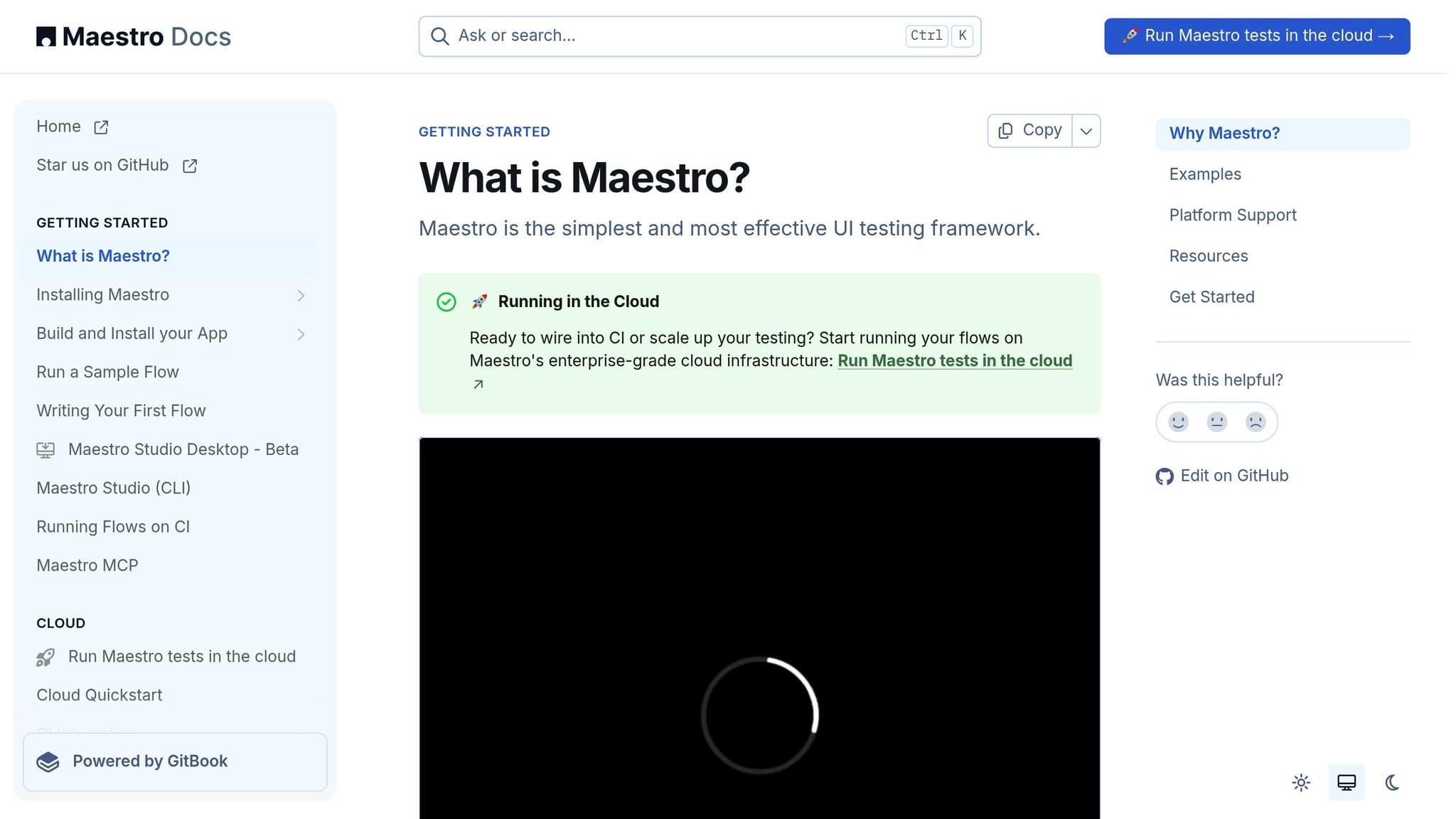
Step 9: Automate Testing with Maestro
Once you’ve established a solid foundation with manual testing, the next logical step is scaling up with automation. As your app grows in complexity, relying solely on manual testing can quickly become overwhelming. Automation doesn’t replace manual testing entirely but works perfectly for repetitive tasks and identifying regressions more efficiently.
Enter Maestro, a tool that simplifies mobile UI automation. With its straightforward YAML syntax, Maestro makes it easy for anyone on your team - regardless of technical expertise - to write tests without needing extensive coding skills.
Why Use Maestro?
Maestro automatically handles flakiness and delays; it knows that UI elements may not be exactly where you expect and that content can take time to load, so it waits for you without needing sleep calls. Tests run while you edit the YAML, which speeds up iteration. Installing Maestro is simple because it comes as a single binary that runs on any platform.
One of the best things about Maestro is that it supports many platforms. Android (Views and Jetpack Compose), iOS (UIKit and SwiftUI), React Native, Flutter, web views and even desktop web. Because the tests are written in YAML, you can reuse the same flow file across platforms instead of maintaining separate test suites.
"Maestro reduces UI test build time by over 10×".
Maestro is perfect for automating critical user journeys like login flows, sign-ups, form submissions, navigation, and checkout processes. The declarative YAML approach makes it easy to iterate quickly. When your app’s UI changes, updating tests takes just a few minutes, allowing teams to maintain broad test coverage without excessive maintenance.
Another standout feature is cloud device integration. Instead of maintaining a physical device lab, you can run your tests across a wide range of device configurations, screen sizes, and operating system versions. This ensures your app performs consistently across the mobile ecosystem.
Best Practices for Automation
To get the most out of Maestro, follow these tips:
- Start small and modular. Focus on critical user flows first, like login or sign-up. Build simple, incremental tests that tackle specific features rather than cramming everything into one massive script.
- Avoid hard-coding values. Use dynamic data sources or generate data on the fly to keep your tests adaptable across environments.
-
Leverage Maestro’s synchronization commands. Commands like
assertVisible,waitFor, andwaitForElementhelp manage timing issues, which are common with loading states, network delays, or animations. - Ditch coordinate-based interactions. Prefer descriptive selectors instead of coordinates. Text and ID selectors make tests more readable and stable. Text selectors improve readability and ID selectors are useful for dynamic content
-
Reuse common actions. Reuse common steps by creating subflows. The
runFlowcommand lets you call reusable flows with parameters and conditions, which avoids duplication across tests. -
Integrate with CI/CD pipelines. Hook your tests into your CI pipeline. Maestro can run flows in the cloud so you do not need to set up emulators. The
maestro cloudcommand can be used in CI workflows to upload and run flows - Review and update tests regularly. Outdated tests can cause false negatives, so it’s essential to keep your automation suite in sync with your app’s evolving UI and functionality.
- Strike a balance between manual and automated testing. Use automation for repetitive, well-defined tasks, while reserving manual testing for areas like usability, visual design, and exploratory testing of new features.
- Make use of dynamic data Maestro 2.0 lets you use DataFaker in JavaScript to generate names, numbers and other random data for tests.
- Keep flows simple. Instead of packing multiple interactions into a single flow, break your suite into small flows that represent a single user goal; this makes them easier to read and run in parallel.
With Maestro, you can streamline your testing process, reduce maintenance headaches, and ensure your app delivers a seamless experience across all platforms.
Step 10: Test Usability and Accessibility
This step ensures your app works seamlessly for everyone, including users with disabilities. Research shows that poor usability leads 67% of users to uninstall apps.
Accessibility Testing
After testing your app's basic functionality, it's time to focus on accessibility. This ensures your app meets standards like the Americans with Disabilities Act (ADA) and the Web Content Accessibility Guidelines (WCAG). Beyond compliance, accessibility broadens your audience and creates a more inclusive experience.
Start by testing compatibility with screen readers like VoiceOver for iOS and TalkBack for Android. Make sure all interactive elements have clear, descriptive labels so screen readers can interpret them properly.
Pay attention to color contrast. Text must be easy to read against its background, especially for users with visual impairments. WCAG recommends a contrast ratio of at least 4.5:1 for regular text and 3:1 for larger text.
Also, check how your app handles text resizing. If users increase font sizes in their device settings, your app should still display everything cleanly without cutting off or overlapping text.
Touch targets need to be easy to tap. On iOS, they should be at least 44x44 points, and on Android, 48x48 dp.
Finally, ensure your app supports keyboard navigation. Every interactive element should be accessible without relying solely on touch input, making it easier for users with limited mobility to interact with your app.
While accessibility focuses on inclusivity and compliance, usability testing looks at how users engage with your app in real-world scenarios.
Usability Testing
Usability testing helps uncover how users interact with your app and identifies potential pain points. Testing with just five users can reveal 85% of usability issues, making it an efficient way to catch problems early.
Start by defining clear goals. Decide which tasks you want to evaluate - such as navigating the onboarding process, completing a purchase, or using a specific feature. Having focused objectives will make it easier to collect actionable feedback.
Create realistic scenarios to guide users during testing. Instead of asking them to explore the app freely, assign specific tasks, like "find and buy a product" or "set up a recurring payment."
Use both moderated and unmoderated testing methods. Moderated sessions let you observe users in real time and ask follow-up questions, while unmoderated sessions capture natural behaviors in users' own environments.
Track metrics like task completion rates, time taken, error frequency, and overall satisfaction. Tools like session replays and heatmaps can provide additional insights. Pay close attention to qualitative feedback - comments about confusion or frustration often reveal the biggest issues.
Remote usability testing is another valuable approach. It shows how users interact with your app in everyday conditions, sometimes uncovering problems that controlled environments might miss.
Testing Checklist Summary
Completing all 10 steps is crucial to ensure thorough testing coverage. UI testing plays a key role in verifying that both visual and interactive elements function as intended. This summary consolidates the main testing steps, helping you streamline your release process.
A brief overview of these steps highlights their importance in verifying every aspect of your app - from setup to usability. Each step serves a specific purpose in building confidence that your app will perform reliably across a variety of devices and scenarios.
Track Your Test Coverage
To monitor your testing progress and spot any gaps, use the table below. Mobile UI testing focuses on evaluating visual elements and interactions to ensure they work correctly across different devices, operating systems, and screen sizes. Tracking each step systematically helps prevent errors or missed areas.
| Step | Primary Purpose | Key Focus Areas | Status |
|---|---|---|---|
| 1. Set Up Test Environment | Build a stable testing base | Device requirements, network setup, baseline configuration | ☐ Complete |
| 2. Cross-Platform Compatibility | Ensure consistent functionality on all platforms | Android/iOS compatibility, U.S. locale settings, screen variations | ☐ Complete |
| 3. UI Consistency | Maintain uniform design and content | Typography, color schemes, design alignment | ☐ Complete |
| 4. UI Functionality | Confirm interactive elements work properly | Buttons, forms, navigation, error handling | ☐ Complete |
| 5. Responsive Design | Test adaptability to screen orientation | Portrait/landscape modes, layout adjustments | ☐ Complete |
| 6. U.S. Regional Settings | Validate localization for American users | Currency ($), date formats (MM/DD/YYYY), imperial units | ☐ Complete |
| 7. Performance Testing | Measure speed and responsiveness | Load times, animation fluidity, response delays | ☐ Complete |
| 8. Interruption Handling | Test resilience during disruptions | Phone calls, notifications, background-to-foreground transitions | ☐ Complete |
| 9. Automation with Maestro | Streamline testing with automation | Script creation, regression testing, continuous integration | ☐ Complete |
| 10. Usability & Accessibility | Ensure inclusivity and ease of use | Screen reader support, touch targets, keyboard navigation | ☐ Complete |
A checklist is an effective way to ensure you cover key UI elements - like fonts, color schemes, hyperlinks, components, and alignment.
Make it a habit to update your test status regularly, especially before releases. Pay close attention to steps where issues have occurred before or where your app has unique requirements.
For better organization, consider creating separate tracking sheets for different app versions or testing cycles. These records can reveal patterns in recurring issues and help refine your testing strategy over time. Accurate test coverage reporting is essential for a smooth release process.
Focus on any uncovered areas, prioritizing critical user flows such as login, checkout, and other core features.
Conclusion
This 10-step checklist is designed to catch critical issues before your app reaches users. Each step builds on the last, creating a thorough testing strategy that examines everything from basic functionality to real-world user scenarios.
By addressing device compatibility, UI consistency, performance, and accessibility, you create multiple layers of protection for your app's quality. This structured approach minimizes the chances of releasing an app with broken features or frustrating user experiences.
Automation plays a key role in this process. Test automation with parallel execution capabilities can reduce regression testing cycle time by up to 70%. Tools like Maestro help overcome many of the challenges associated with traditional testing methods, streamlining workflows and improving efficiency.
Following this checklist ensures a reliable testing process that supports every stage of development. Consistency is key. The tracking table from the earlier section helps teams stay organized and avoid missing critical steps, even under tight deadlines. Teams that stick to structured testing practices often see fewer bugs after release and greater user satisfaction.
Keep in mind that mobile UI testing is an investment in your app's future. Users expect seamless performance across devices, orientations, and scenarios. This checklist offers a practical framework to meet those demands while maintaining development speed through smart automation choices. Use it to deliver an app that not only meets user expectations but also stands out in the competitive app market.